Category Typography

Amper&and

Ampersand
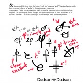
I assigned one of my new designers with the task of redesigning the “&” ampersand. It had to be historical, readable and original. I think this is a good lesson in design as a whole, learning letterforms. He did a pretty good job, I gotta say, so I’m using it as part of a weekly design lecture I have at a company in Tokyo.

Daily Thingamabob

cube
I’ve been asked by Anicom to do a daily doodle for the next year or so. I just started off handing them images of things I’ve been working on for them anyway, and then will start with sketches later on. I don’t think it’s up on the site as of yet, but should be soon. They will post it on their facebook page (which we are working on too) as well. I think that is a pretty good idea, so I may do the same.

Linotype and Bookbinding. Kewl.

’nuff said.

In No Certain Terms

A touch of something I’m working on. More to come.